 _____________________________________________________________________________________________________________________________________________________
I have been so crazy busy over the past few weeks that I haven’t had much time to myself. Needless to say the blog has suffered for this and I haven’t been able to post as much as I normally like to. I’ve been wanting to desperately publish today’s post for over 2 weeks now, and although I am quite a bit behind schedule I am still so eager to share it with you all.
There are two main reasons why I couldn’t wait to publish this post. One is because during fashion week, the graduate show is always bound to be one of my favourites. Young and creative Australian designers, untainted by the realities of the commercial world and keen to show of their hard work. It’s always interesting to learn about the unknown designers, the ideas behind the collections, and get a little glimpse into the future of Australian fashion.
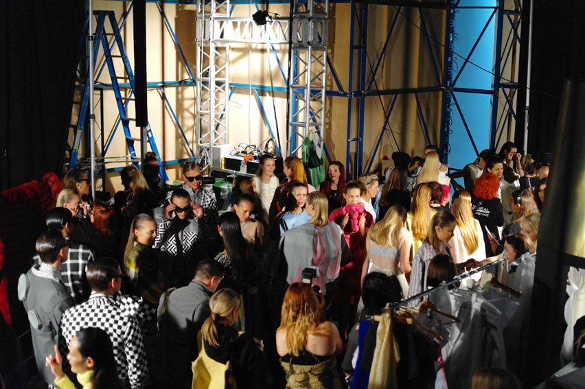
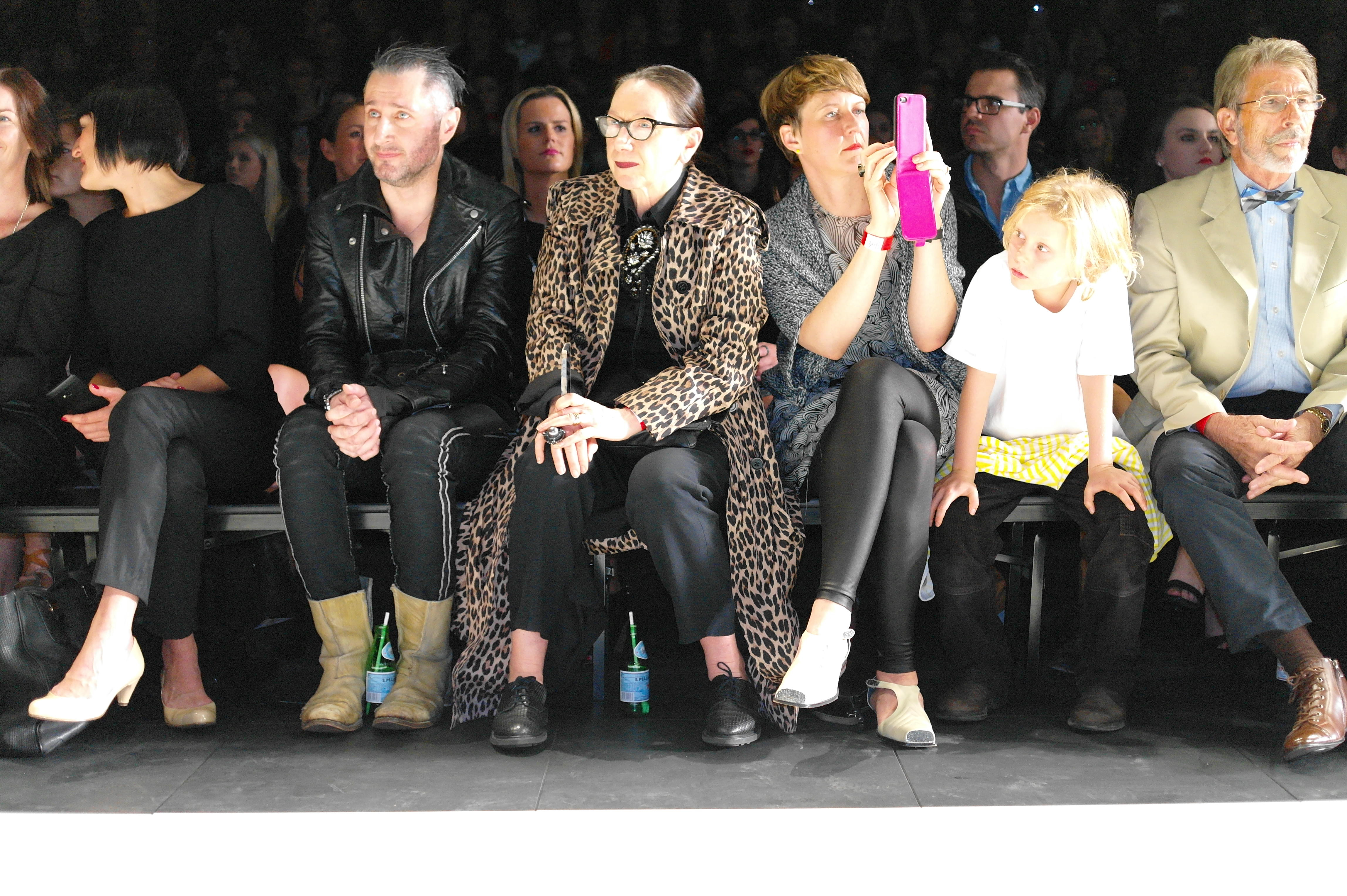
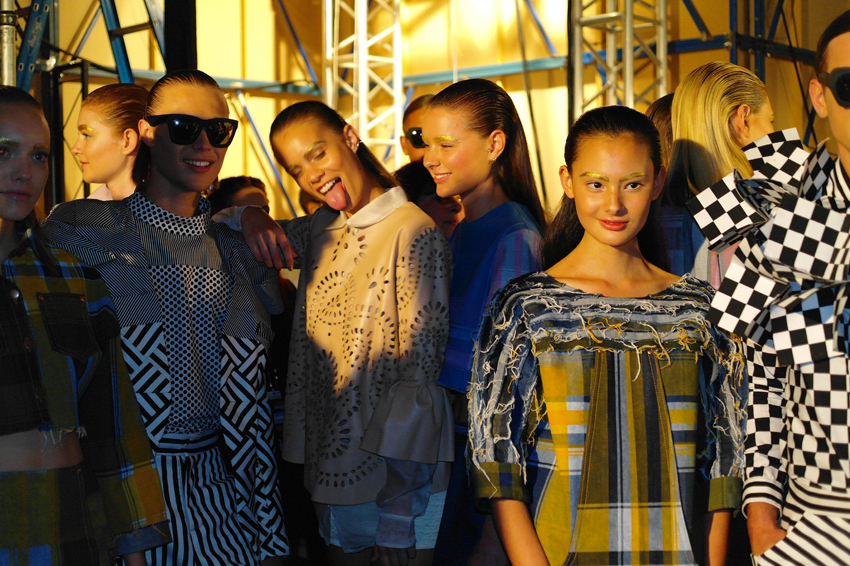
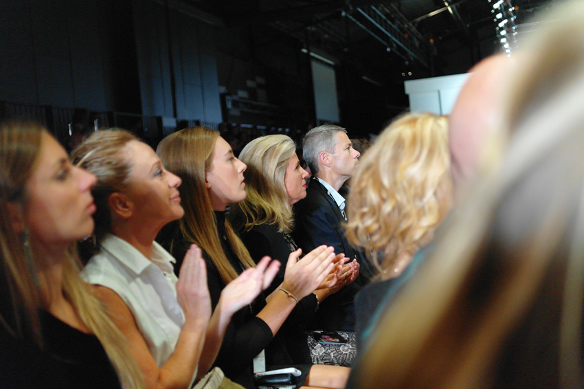
The second (and very exciting) reason is because my incredibly talented photographer friend Paul Batt contacted me letting me know he would also be at the show, and offered to take some behind the scenes, and runway shots for LiLT blog. I freaking admire, and love this man’s work, so you can imagine my excitement when he suggested we work together on this post.
And so I ventured to VAMFF with my good friend Yianni to see what this years graduates had in store for us!
See below for my two cent’s on my favourite collections of the night!
______________________________________________________________________________________________________________________________________________________
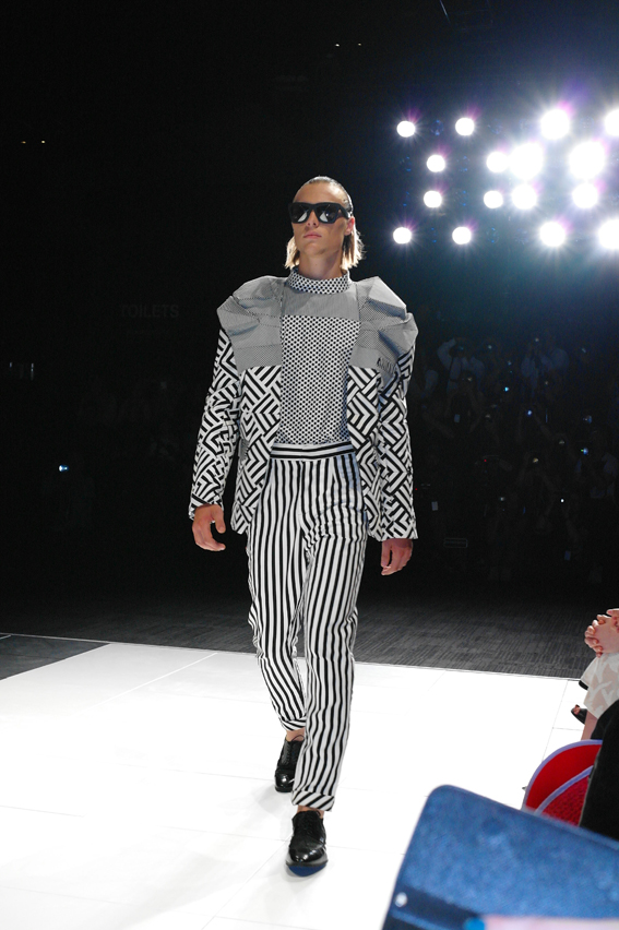
Designer: Yan Wang
I enjoyed Yan Wang’s menswear collection, which was heavily inspired by the bold and geometric op-art prints of the 1960’s. Mostly because I am a sucker for bold geometric patterns, but the silhouettes were also interesting with boxy cuts and unexpected 3d structures incorporated in the suiting.
______________________________________________________________________________________________________________________________________________________
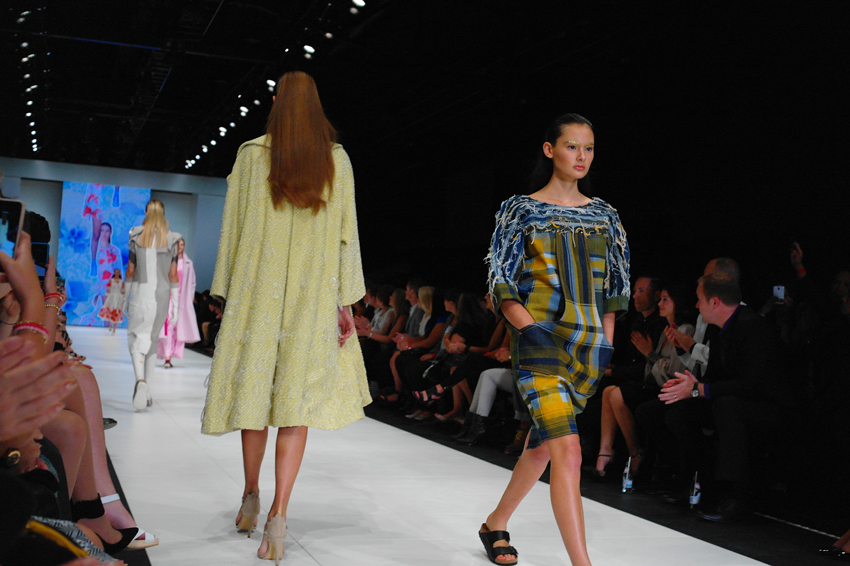
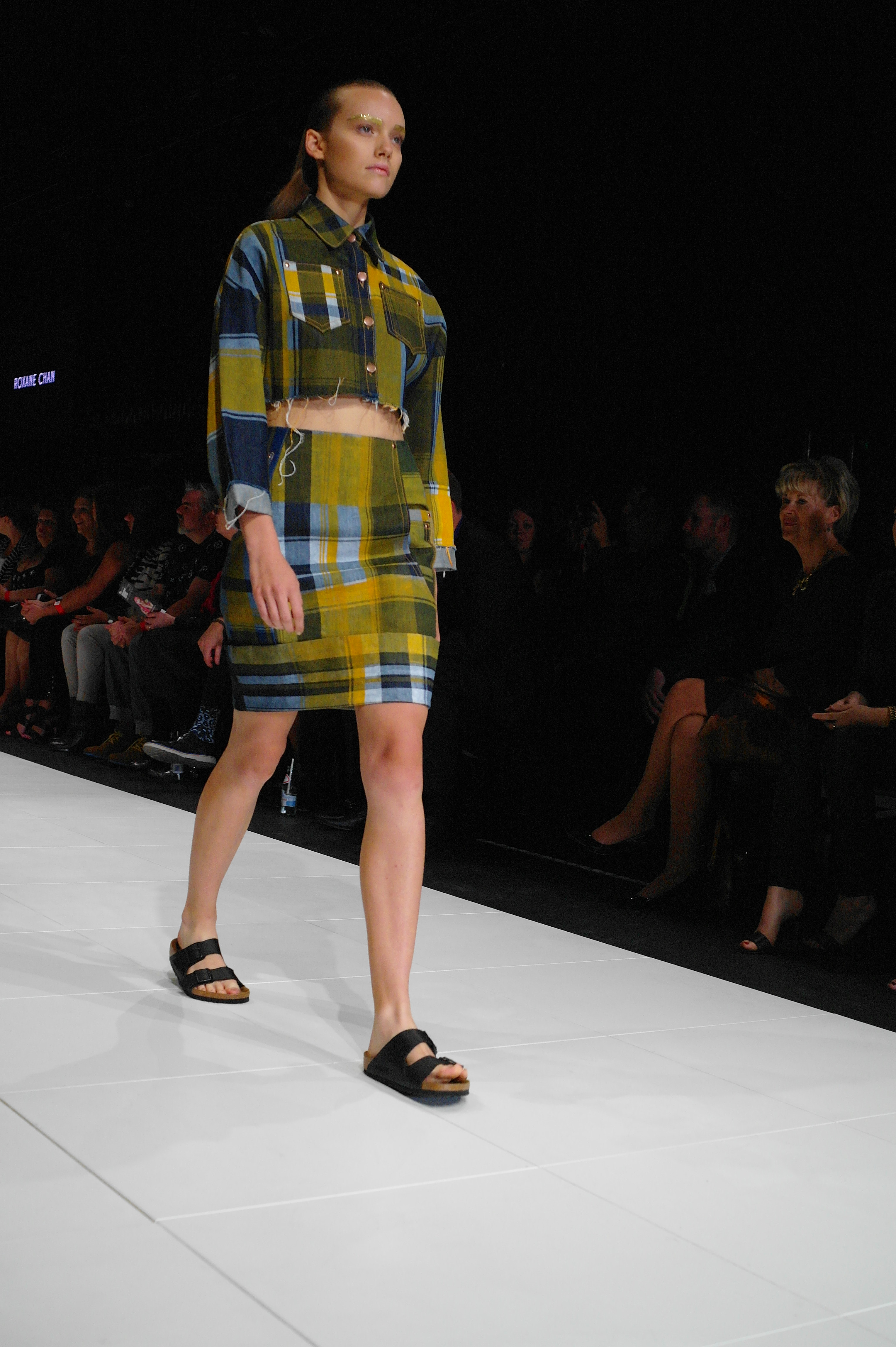
Roxane Chang’s collection, I found was extremely wearable. A fun way to bring colour and design to denim, which is usually a “basic” item of clothing. Lot’s of coloured tartan and raw edges gave the collection a bit of a 90’s edge. The combination of mustard, navy and denim hues are still calling out my name.
______________________________________________________________________________________________________________________________________________________
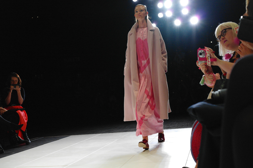 Designer: Edwina Sinclair
Edwina Sinclair’s collection was inspired by emoticons and pop art, but for me it was all about the ankle length, pastel pink, swing coat! It had such a mesmerising shape and movement. It is one of the top pieces, which is still firmly in my mind 2 weeks on.
______________________________________________________________________________________________________________________________________________________
Designer: Wing Chiang
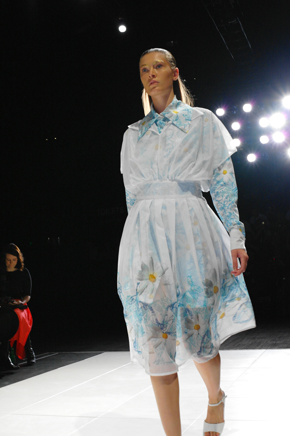
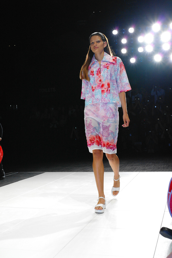
I am not usually one for overtly “pretty” garments but Wing Chiang’s collection was a perfect mix of girly and modern. It was the layers of transparencies formed by sheer silk placed and folded over floral prints, which seduced me. Very feminine, very romantic but still with a bit of attitude.
______________________________________________________________________________________________________________________________________________________
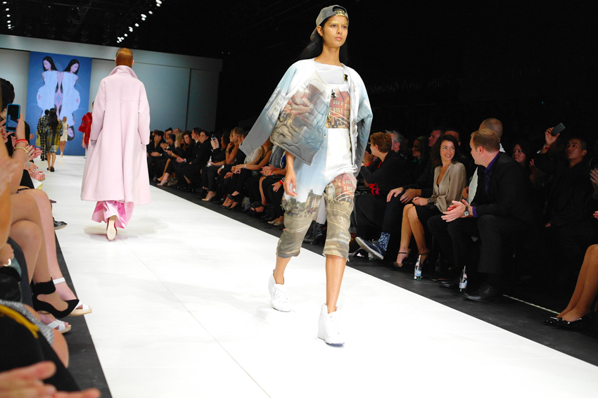
Juliette Booth’s collection was all about attitude. Made as a unisex range, the darts were taken out of all garments to create a boxier, more masculine silhouette. Great digital prints on oversized pieces made for a very edgy, very “street” collection.
______________________________________________________________________________________________________________________________________________________
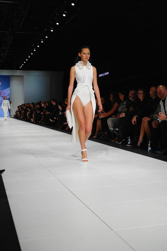
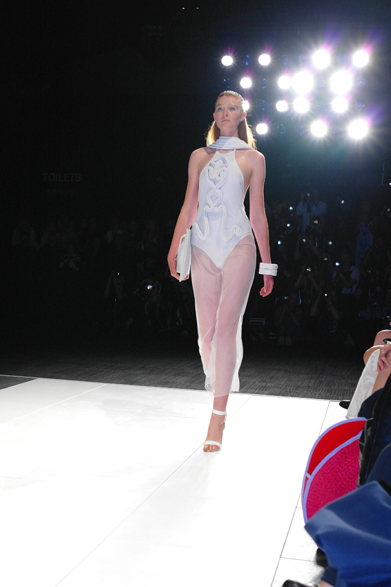
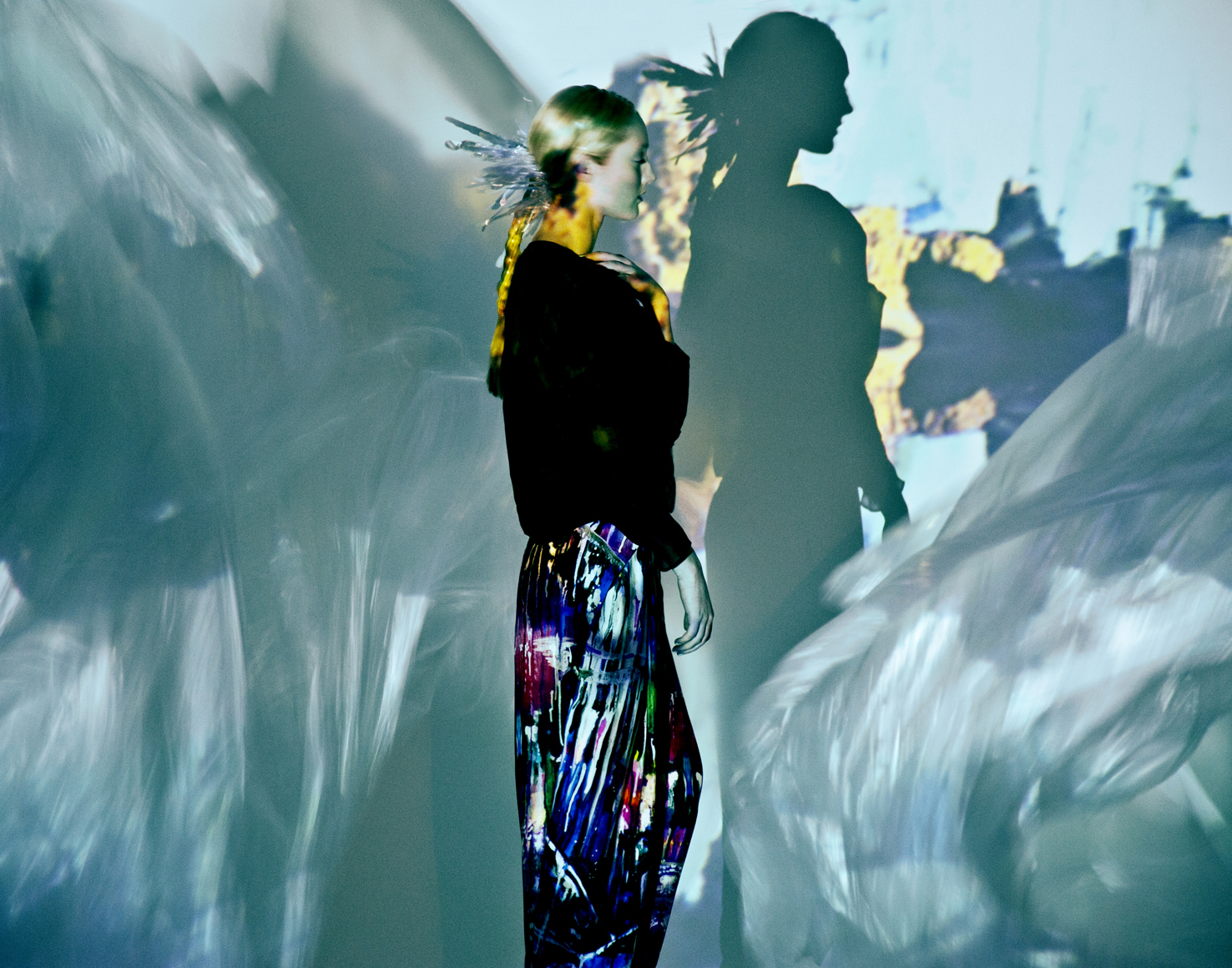
Designer : Gabrielle Brown
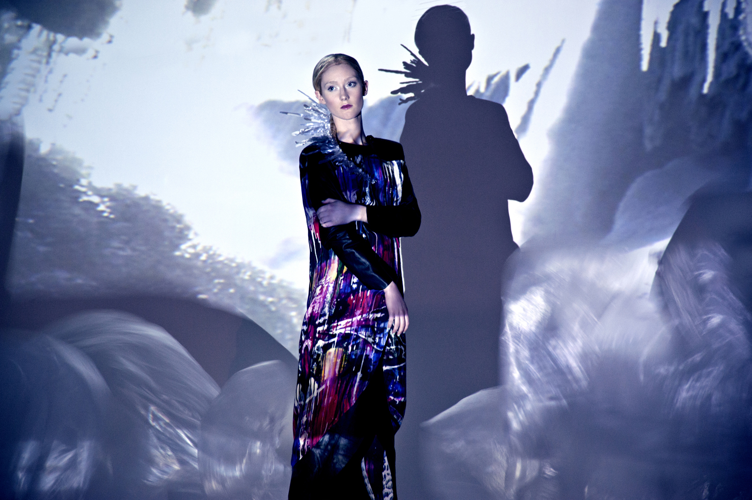
I am so intrigued by 3d printing and its place in fashion, so it’s no surprise I rather enjoyed Gabrielle Brown’s collection. The beautiful mix of delicate details and structured 3d printed features, made this collection so hypnotic. It was a kind of push and pull between a pure soft angel (light transparent silks) and a strong futuristic alien being (Neoprene and opaque sculptural structures)…. So desirable, Really VERY COOL
______________________________________________________________________________________________________________________________________________________
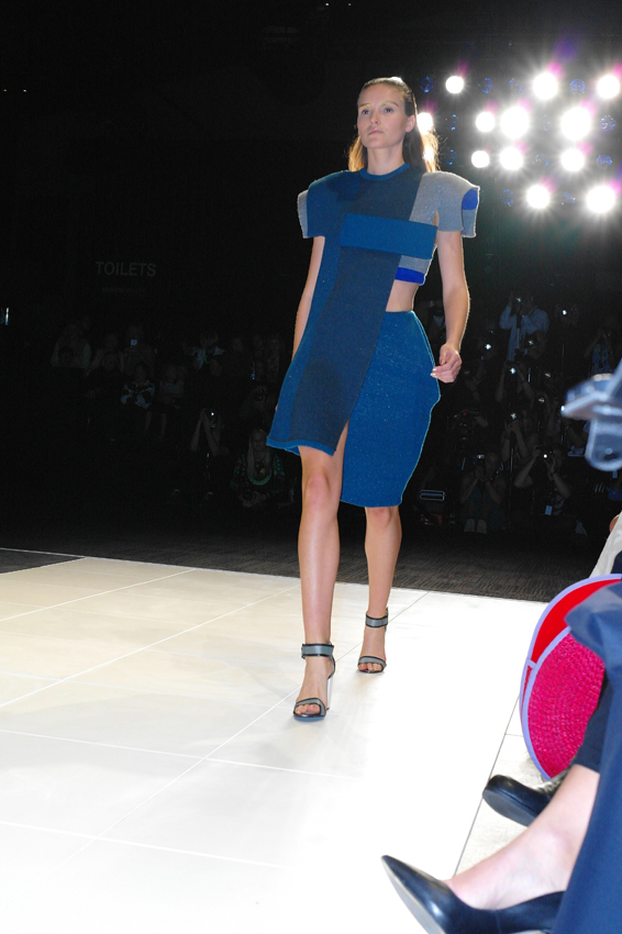
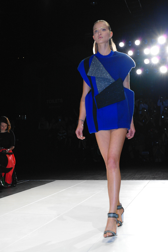
Designer: Anna-Marie Gruber
And last but not least was Anna-Marie Gruber’s collection. Inspired by the film “Vertigo”. An unexpected and original take on knitwear, the pieces stay well away from your usual floppy oversized knit and instead explore bold geometric shapes and lines in the form of architectural inspired silhouettes. Such an innovative take on knits, and such a timeless palette of greys, blues and greens, any piece from this collection would be a real statement. Very avant-garde, and very desirable.
______________________________________________________________________________________________________________________________________________________
And on that note, I would like to say a huge thanks to Paul Batt for very kindly taking these amazing shots. Do yourself a favour and check out his website HERE. And if you happen to be in Queensland make sure you drop in to the “Josophine Ulrick & Win Schubert Photography Award 2104” exhibition at the Art Centre Gold Coast, where Paul’s work will be exhibited. The exhibition runs from 29 March – 25 May 2014.
xo Luci
All photography by Paul Batt
______________________________________________________________________________________________________________________________________________________
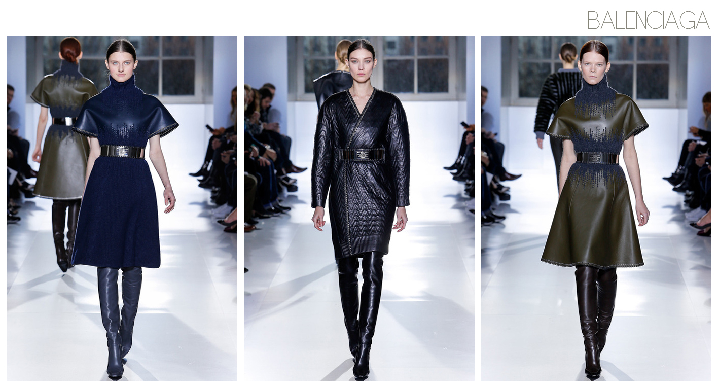
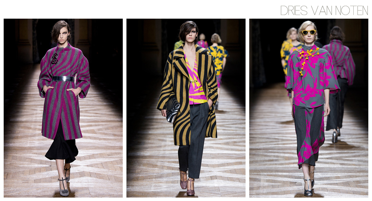
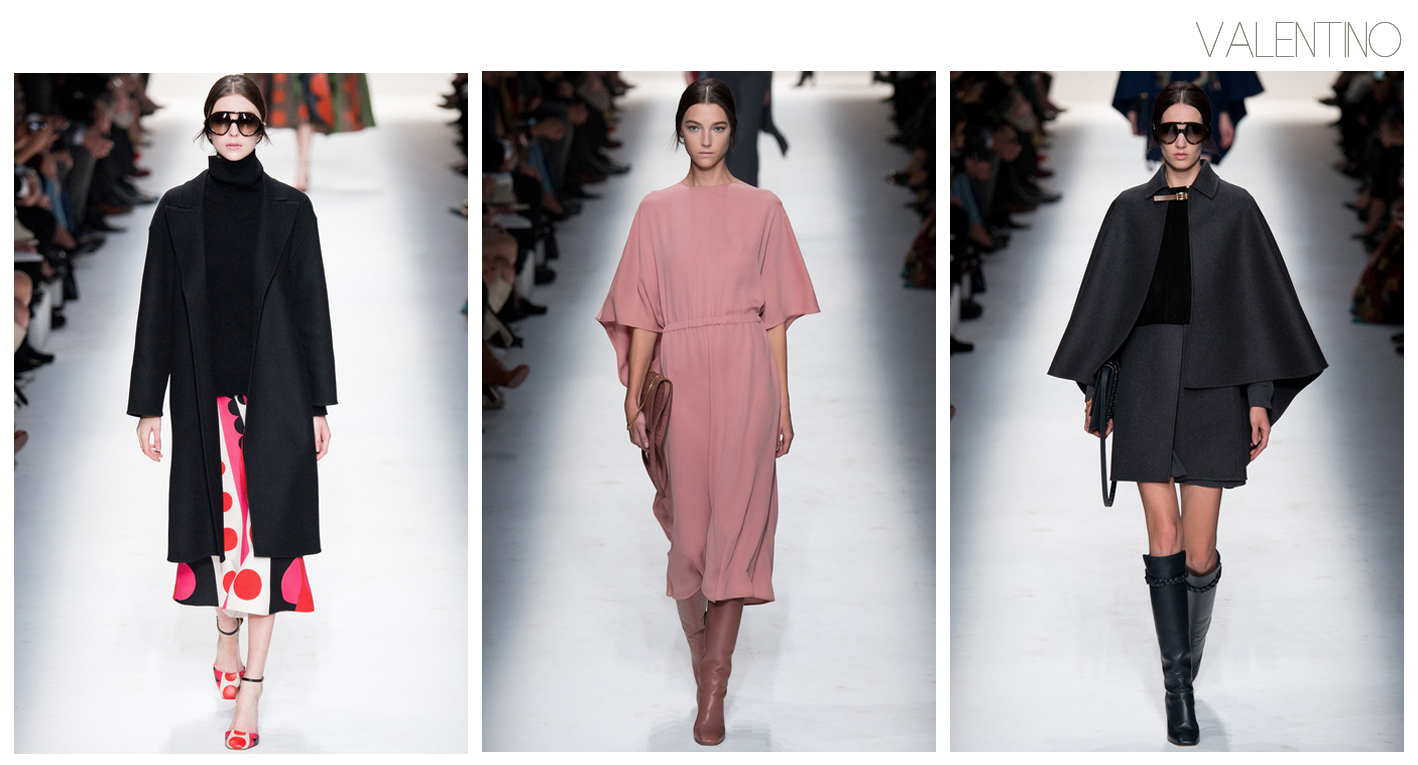
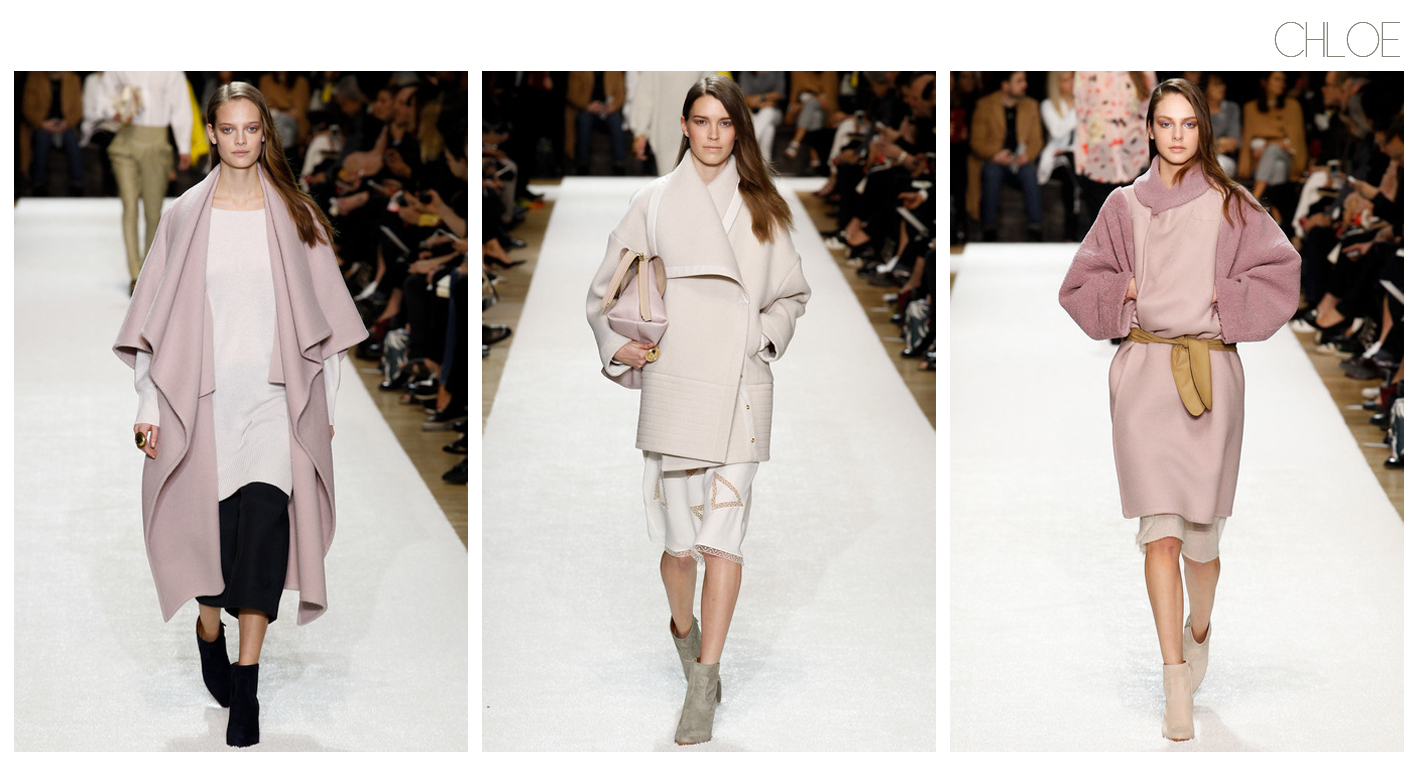
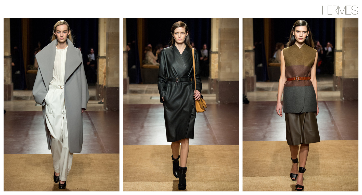
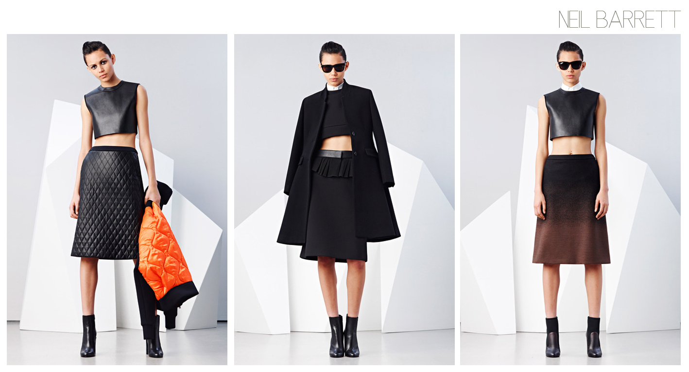

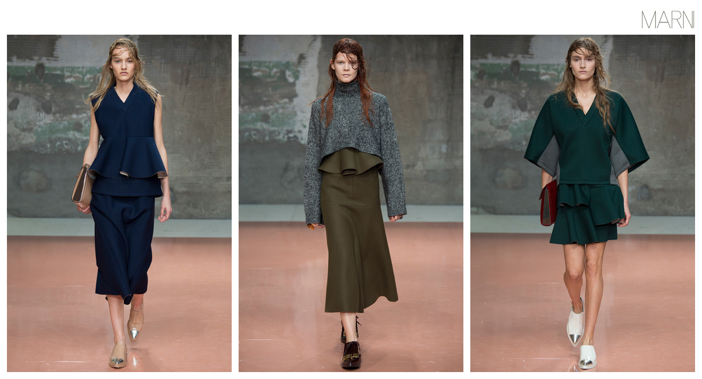
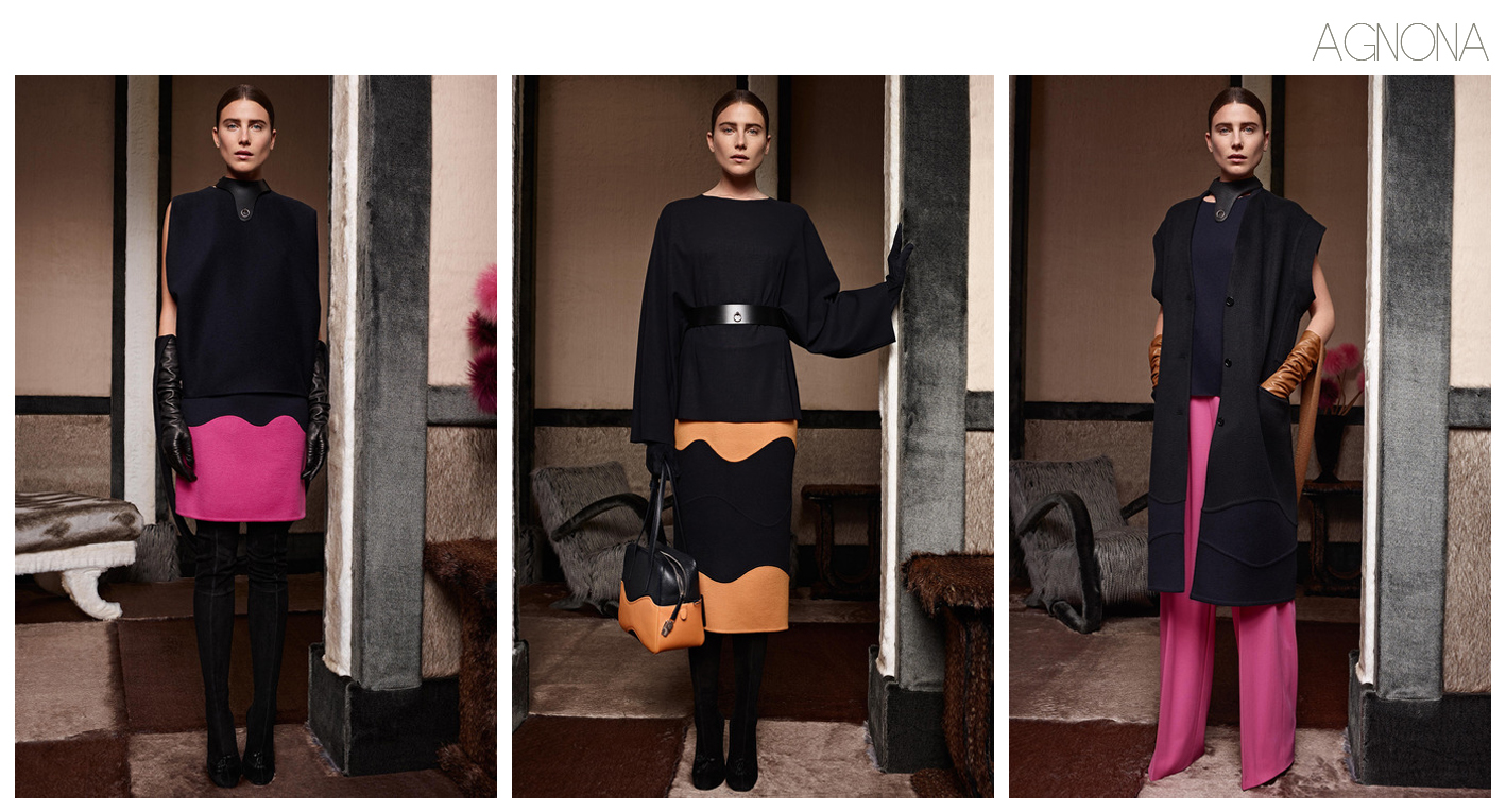
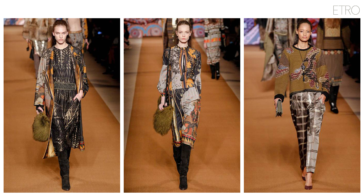
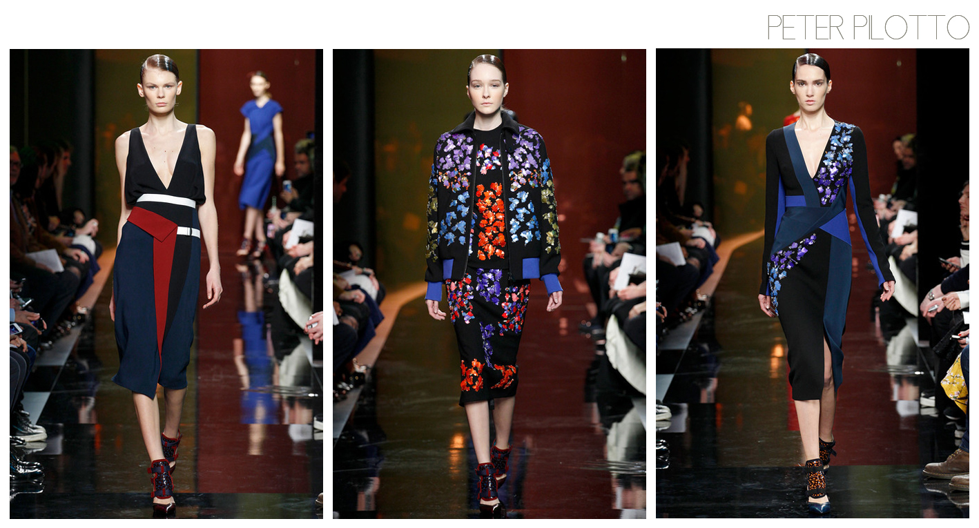
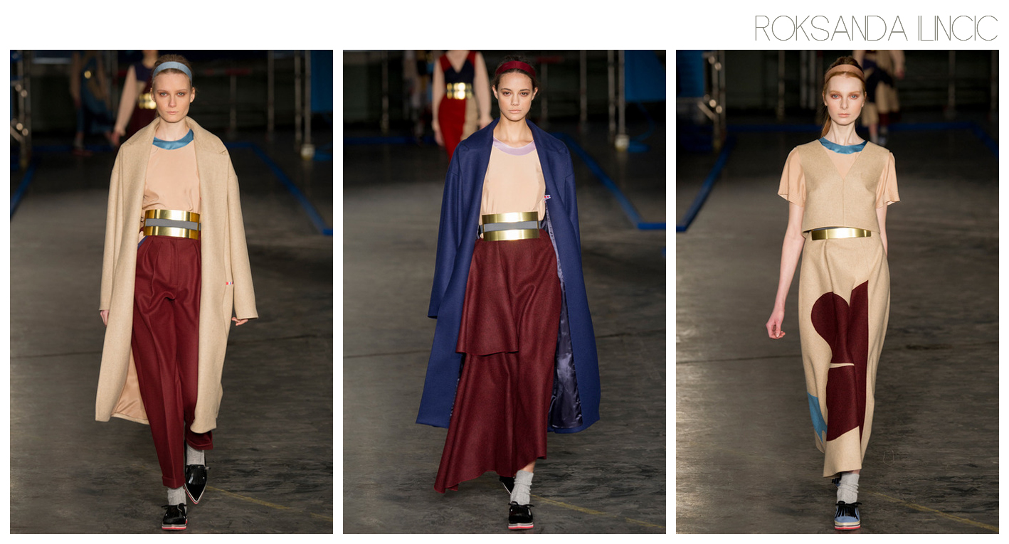
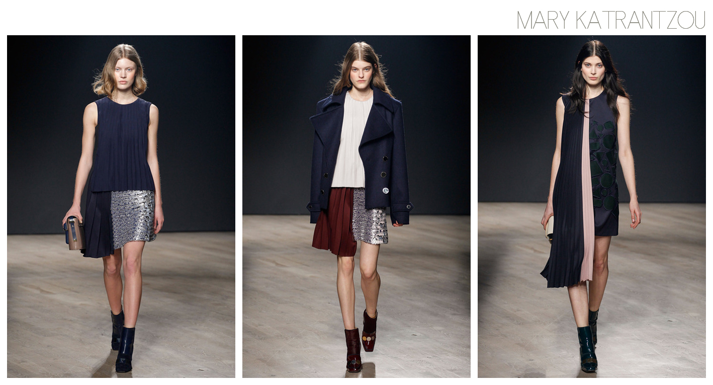
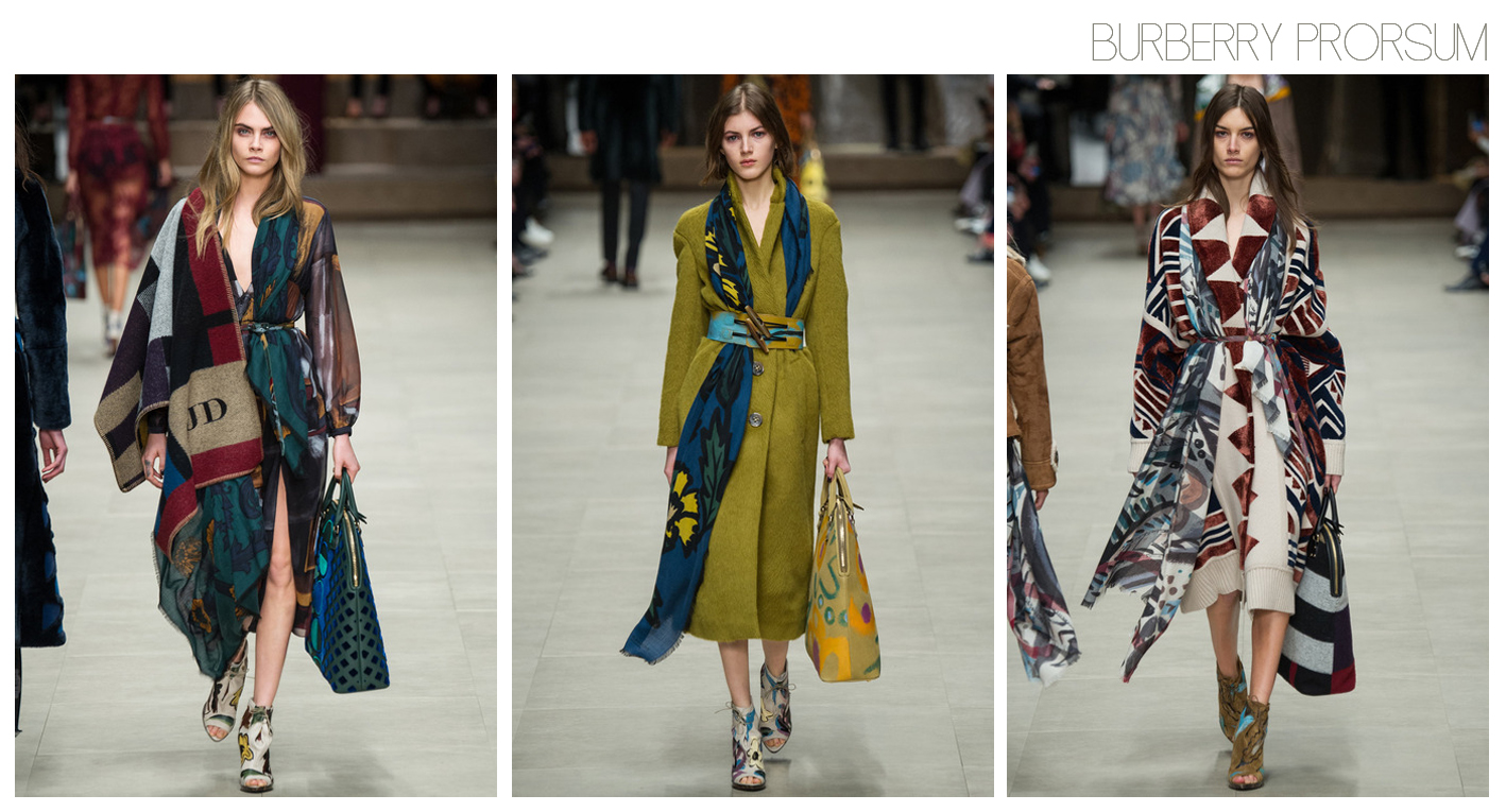
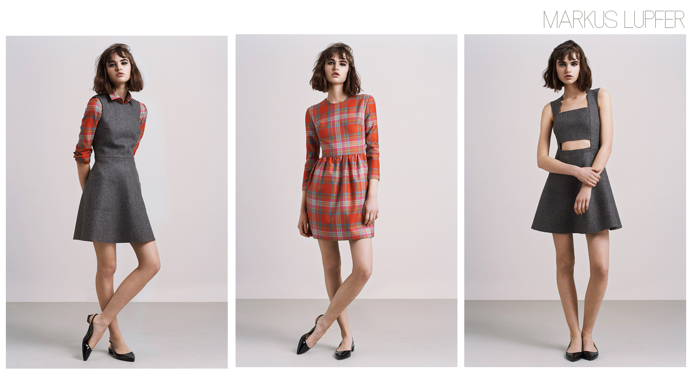
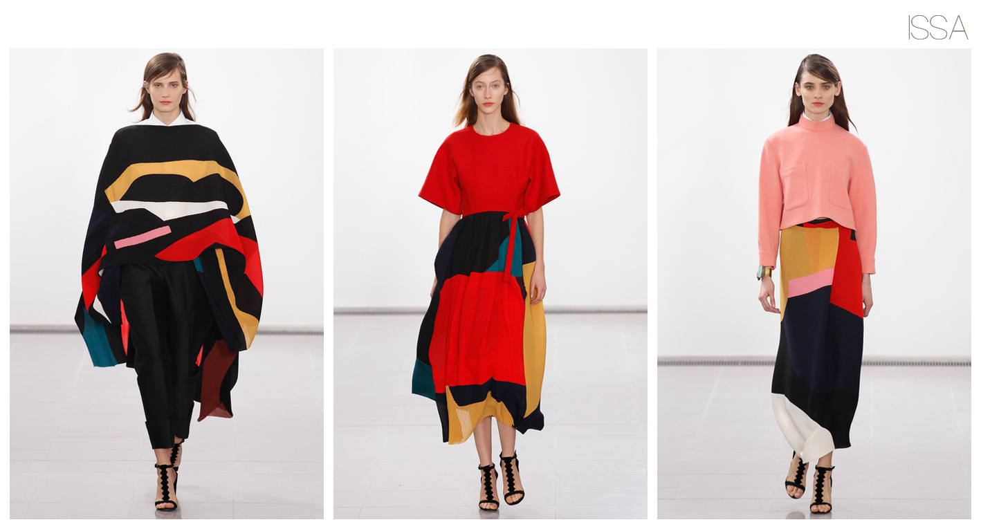 Favourites from London Fashion Week.